Local Business Logo & Visual Identity
Sweetgrain Mills
Sweetgrain Mills was part of my portfolio development to create a brand focused on sustainability and respect for farmland. The brand identity was designed to be trustworthy and friendly, while honoring its heritage as a family company that loves nature.
Scope of Work Logo and Brand Development
Creating the Brand Style
Logo Suite
The logo suite was designed to have a diverse system of versatile logos that worked in all areas, from social media and digital applications to signage and print collateral. The wheat stalk and grain sheaf have a subtle “SM” worked into their design.
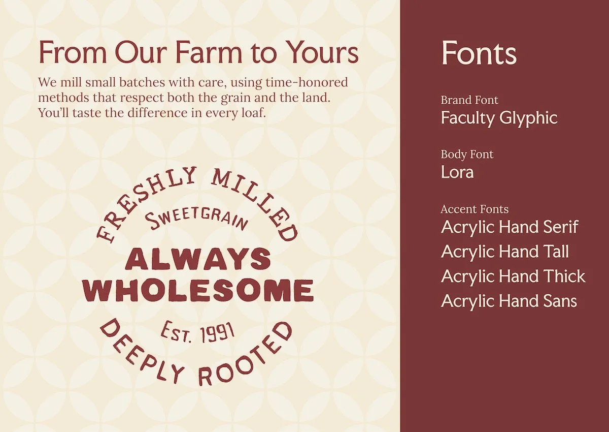
Typography
The brand’s typography system evokes a legacy of traditional farm life and family values. Faculty Glyphic delivers a strong, structured foundation, complemented by Lora’s classic elegance. The Acrylic Hand typeface adds a personal, human touch—drawing inspiration from the hand-painted barn advertisements found throughout rural Ohio.
Colors and Textures
Sweetgrain Mills’ brand identity uses a farm-inspired color palette and organic textures to reflect the richness of natural grains. Earth tones drawn from soil, wheat, and stone create a grounded, authentic feel. Textural patterns—echoing millstone furrows and wheat grains—add depth and movement across packaging and print. The overall aesthetic feels warm, handcrafted, and rooted in heritage.
