
Bakery Branding & Website Redesign
A&B Cookie Co.
A&B Cookie Co. is a local bakery that wanted an updated branding and website. They felt their old visual style no longer aligned with who they were and needed to adjust their appearance to match.
Scope of Work Complete Rebrand and Custom Website
Clarifying the Brand Message
The Process
A&B Cookie Co. had cycled through a few different logos, but none felt quite right. As the business evolved, their branding lagged behind—they needed a visual identity and message that better reflected who they were becoming. While their cookies were highly customized, their messaging didn’t fully capture the warmth, personality, and craftsmanship behind their product.
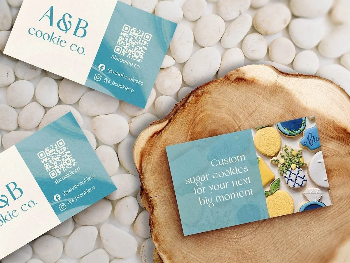
I wanted to highlight the handmade nature of A&B’s cookies while reflecting the brand’s desire to feel classy—without crossing into old-fashioned or overly formal. The goal was to create a brand that felt elegant, approachable, and handcrafted.
Developing a handcrafted brand identity
Defining the Brand Attributes
The new logo centers around the ampersand to reflect both simplicity and elegance. The logo suite flexible enough for use across packaging, ads, and social media. The subtle whisk detail cleverly incorporates the business’s initials, connecting to both the name and the baking theme.
Logo
Final Logo Set
The type system blends classic and modern styles to strike a balance between timelessness and personality. I chose Original by Sensatype to break away from the cursive-heavy logos among local bakeries—it brings a unique and contemporary tone that still feels warm and handcrafted.
Typography
A distinctive palette was key to setting A&B apart from the muted or overused colors common among small businesses. The palette is soft yet rich, inspired by the textures and tones found in decorated sugar cookies—like frosting, marbling, and layering. Handmade illustrations and botanical elements give the visuals an organic, earthy charm.
Color Palette & Style
To ensure the brand stayed consistent across platforms and marketing materials, I created a clear, easy-to-follow brand guide. It includes logo usage, color rules, typography, tone of voice, and imagery examples—so A&B could stay visually aligned no matter where their brand appeared.
Equipping the brand for growth
Creating a Scalable Brand Guide
The website was designed to feel welcoming and cohesive. My goal was to make a site that was simple to navigate, visually aligned with the new brand, and optimized for both mobile and desktop users. It emphasizes A&B’s craftsmanship and makes it easy for customers to inquire or place custom orders.